
Arete Marketing Collateral Design

Arete Financial and Legal Solutions returns to Rennacker Studio for us to work together on rolling out the branding that we started in 2023 to a number of marketing collateral items. The goal was to extend their brand identity and elevate the overall presence of the Arete brand. As a financial and legal firm based in Arizona, Arete needed a coherent way to communicate its diverse offerings and assert its presence in a competitive market. We developed a design system that would spotlight their services and provide a strong visual foundation for all of their printed materials.
First Encounters Worth Remembering: Bold Business Cards
We began this project with designing the business cards. Often times working with a more difficult challenge, like fitting a lot of information into a small space, is a good way to dive into a project to develop a system that is both simplistic and impactful.

We created individual cards for 14 employees, ensuring that each one reflected the cohesive brand language we had developed for Arete. We wanted to be very meticulous in designing these cards—after all, they're often the first encounter a person has with the brand. Adding a distinctive touch, a raised spot gloss varnish over the logos on both sides of the cards, brought a tactile luxury that potential clients could feel, making each card a statement piece that would evoke quality and attention to detail, characteristics Arete truly embodies.

Communicating with Clarity: Trifold Brochure
Designing any trifold brochure is always an exercise in clarity. It's a common staple in marketing collateral, but often, they're a missed opportunity—overloaded, uninformative, or just lacking simple things like contact information. We made sure Arete's trifolds stood out by articulating their four service pillars clearly and succinctly while providing enough white space to let the design breathe. As a result, Arete’s new brochure is informative but also invites potential clients to engage with Arete's vision of "Complete Financial Well-being” through one of their for service pillars; tax, accounting, legal, and financial planning.

We knew that these brochures often serve as a silent salesman; they can be the crucial touchpoint where potential clients decide to engage further or not. To navigate this, we immersed ourselves in Arete’s brand story, translating complex financial and legal concepts into accessible, inviting content. Our aim was to design something that caught the eye and held the reader's attention with informative but brief information. It was about making every panel count, ensuring that as the brochure unfolded, so did Arete’s story of expertise.
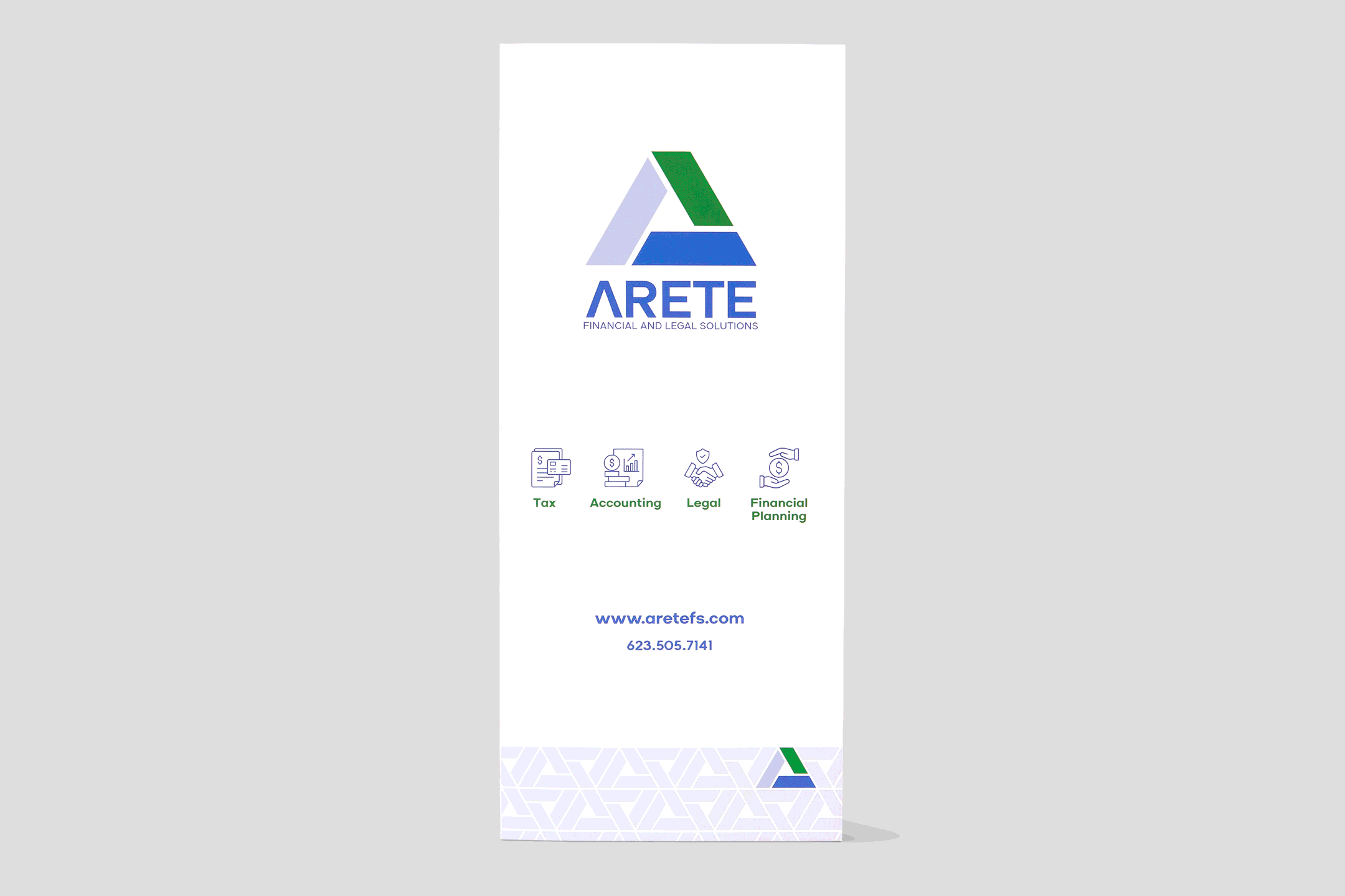
Each of the brochure's panels was carefully planned to lead into the next, creating a seamless transition through Arete's services. The trifold was designed make clients consider the entire suite of services Arete offers as a package for financial well-being, rather than simply coming to the office for one service, take care of everything you need in one spot. We used visual icons to guide readers through the content, with color-coded sections and clear headings that made navigation intuitive.

A Minimalist Approach: Custom Letterhead
In contrast to some of the other deliverables we created in this project, the letterhead was designed with a more minimalist approach. On top, we placed Arete's logo and essential contact details, leaving plenty of room for their important correspondence. The footer was a strategic design element, echoing the firm's mission statement and service pillars, reminding clients of Arete's commitment to their financial and legal well-being.

Pivoting Away from Unexpected Challenges: Branded Envelopes
Arete’s envelopes presented a somewhat unique challenge. Our original design featured a solid blue back with white text and icons. But this design faced a setback due to the imprecision when the envelopes are folded at the printer. We adapted quickly, opting for a simple, white back while keeping the blue seal flap.

We also introduced a security pattern inside the envelope that cleverly used the Arete logo's triangle, ensuring privacy and adding a subtle brand touch.

Wayfinding For A New Office: Outdoor Signage
Arete recently moved offices to a location that has a very unique setup. There are two suites that are a part of, the main building but have completely separate entrances. A lot of customers were going to the main entrance, trying to find Arete, not knowing that their suite had it's own entrance. We created some simple A-frame signage to help point clients in the right direction while clients get used to Arete’s new location.

Organizational Color Coding: Document Folder Design
At the pinnacle of this project were a series of document folders that the Arete team used to return documents to their clients. These folders used an intuitive color system that would help Arete's staff quickly identify services, a crucial feature during their busiest times, like tax season. The colors needed to be part of Arete's brand palette but also functionally distinct. Each separate color had a distinct role: green for accounting, blue for taxes, dark grey for legal and financial planning, royal purple for non-profits, and vermillion red for tax audits.
We also recommended that we explore the option of introducing gusseted folders as a practical solution for the bulky document sets that the financial and legal sectors often have to manage—ensuring the folders remained functional without compromising on style or bursting at the seams.


We also recommended that we explore the option of introducing gusseted folders as a practical solution for the bulky document sets that the financial and legal sectors often have to manage—ensuring the folders remained functional without compromising on style or bursting at the seams.

We’re so honored that Arete has been such an incredible partner in trusting us fully to help bring their brand to it’s fullest potential. This marketing collateral rollout was just one more step towards a more unified design ecosystem for their business and we’re excited to continue rolling out their other assets in the future. In our humble opinion, Arete’s brand is quickly turning into one of the best-designed firms in the Phoenix valley—maybe in all of Arizona.
