
Synergy West Recycling and Waste

Measuring Accessibility
Our accessibility audit brought to light significant accessibility challenges, including the absence of alt text in images, buttons lacking accessible names, and suboptimal background to text color contrast ratios. This oversight in accessibility poses barriers for users with visual impairments and a suboptimal experience for able-bodied users. Additionally, non-compliance to Web Content Accessibility Guidelines (WCAG) accessibility standards substantially increases Synergy West’s likelihood of a major lawsuit should a particularly litigious user encounter the existing site. Our Lighthouse accessibility report indicated an overall site accessibility rating of 52% which is frankly the worst I’ve ever seen.

Measuring Usability
Our heuristic analysis uncovered parallel findings in terms of usability. In determining the severity of usability issues, we opted for Jakob Nielsen’s severity scale, recognized as the standard in web page usability. This scale, designed to assess the market impact of any particular problem on the website, and rates issues on a scale of zero to four, with classifications ranging from no problems at zero to a usability catastrophe at a level four.
Some of the most critical usability issues, registering as a three or a four on the severity scale, centered around the website's unresponsiveness for various devices. Specifically, the primary navigation diminishes from a total of ten links, down to just two or three for mobile, and consolidates any overspanned links into a single "more..." button. This introduces numerous usability and accessibility challenges. Additionally, the current site design exhibits inconsistencies in fonts, colors, and layout hierarchy, coupled with multiple WCAG accessibility issues.
Jargon emerged as a potentially significant usability hurdle since not every site user will be familiar with the technical terms prevalent in the waste and recycling industry.

A Redesign Strategy Informed by Traffic Insights
Before proceeding with further asset assembly, we aimed to evaluate the current site's analytics to comprehend its traffic patterns and the primary device types through which users access the website.
As of October 2023, the year-to-date analytics reveal that 69.3% of traffic to the Synergy West site originated from mobile devices such as smartphones. Only 29.3% came from desktop devices like laptops and desktop computers, and lastly, 0.01% visited via tablet devices. This analytic information clearly indicates that our redesign suggestions should prioritize mobile users while ensuring an equally satisfying experience on desktop.
Year-to-date analytics also revealed some erratic traffic patterns on the current site. Steady growth from January to February hints this was likely when the site whs initially launched. March to May saw modest growth, followed by a significant 50% dip in June followed by a seven-fold traffic increase from July to mid-August. This spike contrasts with a swift return to normal levels by October. We lacked any information on marketing or advertising activities during the peak months, but those peaks highlight the potential to attract over 600 unique monthly visitors to the site. In turn, this has the potential for improved conversion through a more user-friendly site.

User Personas for the Waste Industry
Now that we had gathered information from existing sources, we needed to seek out information we didn’t possess about the Recycling and Waste industry, an industry that generally doesn’t live in our daily service purview. Waste disposal isn't a topic people often want to contemplate, and given the industrial scale of Synergy West's operations, catering to the right users was crucial.
To understand our potential users and their information needs on a site for Synergy West, we first needed to understand our hypothetical users. We crafted diverse user personas, encompassing individuals from various industry types with complex and unique backgrounds, goals, and needs.
Our first persona represented a construction site manager seeking efficient and environmentally friendly waste solutions for their construction sites. They emphasized cost, reliability, consistency, ease of integration, and compliance with disposal regulations as their primary needs.

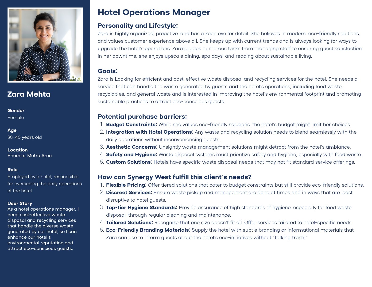
The second persona portrayed a hotel operations manager aiming to upgrade operations in line with new ecological goals set by her hotel’s corporate office. Her criteria included cost-effectiveness, seamless integration, adherence to safety regulations, and aesthetic invisibility to hotel guests.
Our third persona embodied an apartment building owner-operator who requires a cost and space-effective solution for their multi-family apartment complex. Key considerations included frequent and reliable pick-ups, in harmony with the eco-conscious community living in the Phoenix Metro area.

The fourth and final persona depicted a commercial building facilities manager in search of efficient and reliable waste disposal and recycling services. Their goal is to cater to the diverse businesses across her organization’s various properties.

User Research
With these personas and the generated user stories, we crafted a survey comprising 18 questions, concluding with an attention-confirming question unrelated to the research to ensure participant engagement. However, the client opted against conducting research for various reasons:
We considered using a third party to source research responses from relevant industry individuals, but the associated cost, nearly $3000, and the inability to use personally identifiable information (PII) for marketing led to the decision against it. Our studio prioritizes safe and legal marketing practices over profit, and we work very hard to safeguard our participants' PII.
We proposed leveraging Synergy West’s existing email list to gain first-hand feedback from current and potential clients. However, Synergy West declined due to concerns about the optics of reaching out to clients.
We finally suggested obtaining feedback from five current clients for qualitative insights. Unfortunately, the client did not respond, prompting us to forgo formal research to adhere to deadlines.
This information will be presented to the client as a significant caveat to our design recommendations, emphasizing that we cannot guarantee improved user satisfaction without genuine interaction with, or surveying of clients and individuals within the relevant industries.
Building a Benchmark for Usability Testing
Given the less-than-optimal outcome of our research objectives, we sought to build our own benchmarks by conducting usability tests on Synergy West’s current website—leveraging the usability issues identified during our accessibility and heuristic analysis as our scope.
To conduct usability tests on Synergy West’s current website, we enlisted five of our own users, aligning with Jakob Nielsen’s recommendation: "The best results come from testing no more than 5 users" (Nielsen, 2000).
When formulating our usability test plan, we aimed to evaluate the current site's usability from multiple angles, establishing clear performance benchmarks for our redesign. Six task categories were created, each assigned an importance level on a scale of one to five (one being least important, five being most important). Additionally, we identified six scope areas, assigning the same importance scale to those. We also classified issues based on whether they should be resolved as a suggestion, strong suggestion, minor issue, major issue, or blocker issue; also assigned numeric rating scales from one to five.
Finally, we wanted to easily capture users' raw externalized thoughts, and categorize them as positive, negative, or neutral. This qualitative method was simply to help us gain more insight that could be used during design to understand user sentiments and assign them to the relevant task and scope categories.
Once issues and sentiments were captured, categorized and prioritized, we could pinpoint where to concentrate our efforts and generate solution recommendations.

Initial Usability Test Results
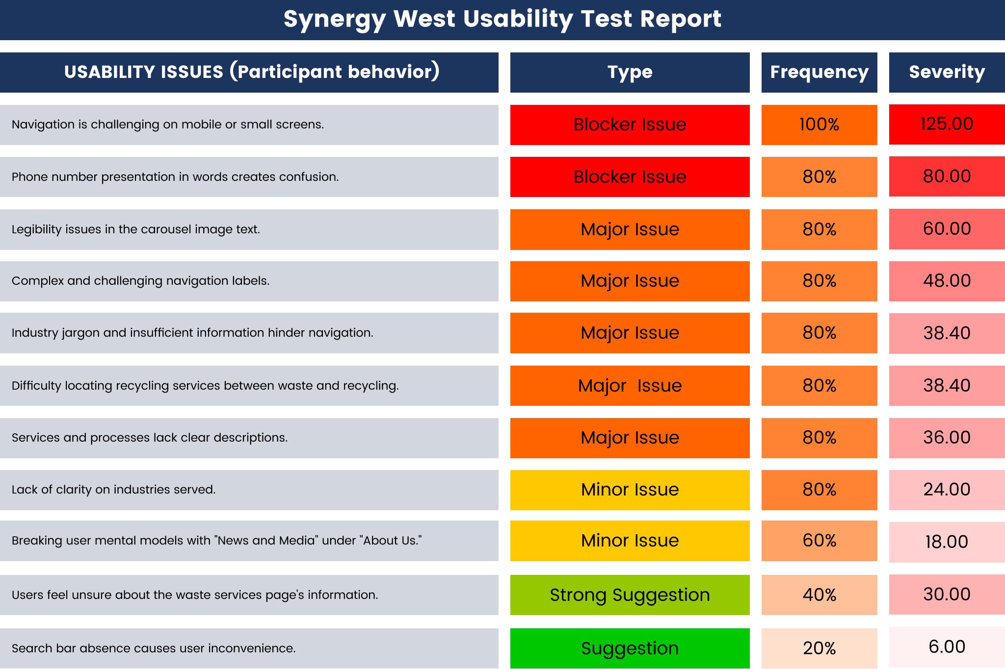
From our initial usability tests, 26 usability issues were identified across 11 categories. Among these, 4% were suggestion issues, 15% were strong suggestion issues, 27% were minor issues, 39% were major issues, and 15% were blocker issues. The average frequency of each issue was a significant 71%.
Notably, the navigation issue we uncovered during our heuristic analysis proved itself as a primary challenge for every single user in nearly every task.
An unexpected issue arose from the 37 comments recorded, of which, 81% were negative and 19% were neutral. Users struggled to contact Synergy West due to their phone number being spelled out alphanumerically (1-877-syn-west) rather than presented numerically (1-877-796-9378). Additionally, users expressed uncertainty about task completion due to the presence of industry-specific jargon.
Task performance was measured using task completion rate (the rate at which a user successfully completed a task) and task completion time (the time taken by each user to complete each task). The task completion rate for our initial tasks was 77%, with users facing particular challenges in finding information about the industries that Synergy West serves. The task completion rate for our initial tasks was 43.10 seconds averaged out across the time it took each of the five participants to complete each task.
Our Recommendations for Redesign
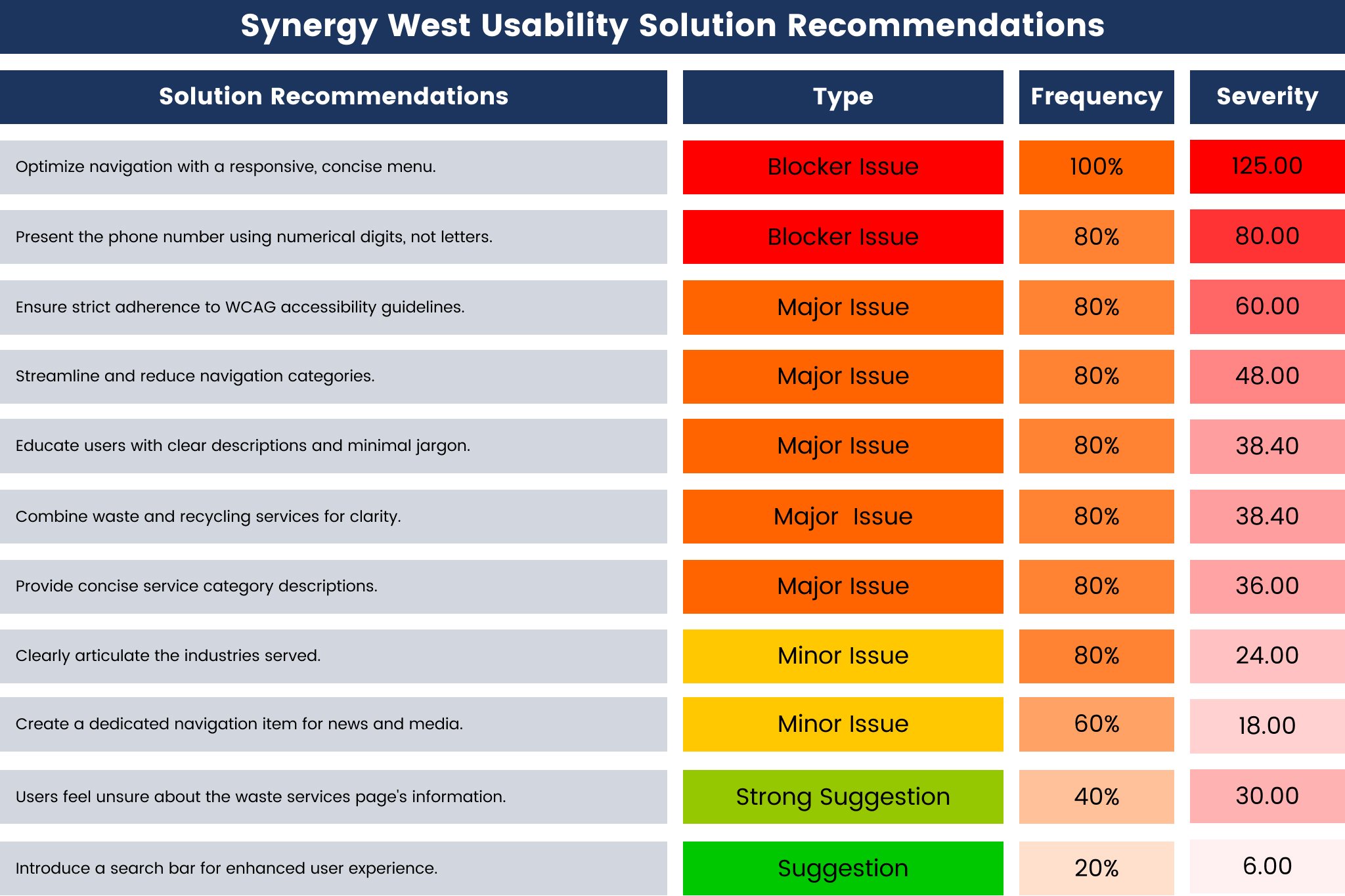
Now that we have a clear direction on what requires our attention, we can formulate hypotheses for potential solutions to the identified problems. Our solution recommendations involve designing a responsive and mobile-friendly navigation menu, while strictly adhering to WCAG design accessibility standards. We also propose clearly defining each industry that Synergy West serves, incorporating concise descriptions for each equipment and service category in addition to each industry served. Other recommendations include minimizing jargon, assigning a dedicated navigation element for "news and media," consolidating ambiguous navigation pages and using clearer navigation titles, reducing the overall number of navigation elements, and, importantly, representing the phone number using numeric digits instead of letters.
Research to Redesign
Incorporating the design recommendations uncovered during our UX research, we set out to devise a comprehensive solution, addressing each identified problem and striving to craft a website that is clear, accessible, useful, usable, and maybe even beautiful for Synergy West.
To initiate the design process, we conducted a competitive analysis of the key players in the industry.
Waste Management stands as the industry titan, particularly in Phoenix where they are headquartered but also nationally. They boast a prominent design presence with an iconic typographic logo and a vibrant color palette that speaks to an eco-conscious mindset. Their website features distinct categories for residential (which Synergy West doesn't serve), business, and roll-off dumpster rentals—a parallel to Synergy West's equipment sales division.
Waste Management stands as the industry titan, particularly in Phoenix where they are headquartered but also nationally. They boast a prominent design presence with an iconic typographic logo and a vibrant color palette that speaks to an eco-conscious mindset. Their website features distinct categories for residential (which Synergy West doesn't serve), business, and roll-off dumpster rentals—a parallel to Synergy West's equipment sales division.
Republic Services is another industry leader and a primary competitor, featuring a slightly municipal design aesthetic with the trope-ish “blue conveys trust” which is all I can imagine the designer saying when they pitched this color to the stakeholders. Republic Services emphasizes residential and business services on its website. Additionally, they showcase their commitment to sustainability prominently.
Republic Services is another industry leader and a primary competitor, featuring a slightly municipal design aesthetic with the trope-ish “blue conveys trust” which is all I can imagine the designer saying when they pitched this color to the stakeholders. Republic Services emphasizes residential and business services on its website. Additionally, they showcase their commitment to sustainability prominently.
Waste Connections, while they can be considered a third competitor, they are somewhat less memorable. Similar to the others—they cater to both residential and commercial waste needs and offer dumpster rentals. While their design potential appears underutilized, we will keep an eye on them, although they might not serve as a significant inspiration source for our solutions.
Waste Connections, while they can be considered a third competitor, they are somewhat less memorable. Similar to the others—they cater to both residential and commercial waste needs and offer dumpster rentals. While their design potential appears underutilized, we will keep an eye on them, although they might not serve as a significant inspiration source for our solutions.
It's worth noting that all three competitors share design similarities, with Waste Management leading in design aesthetics, closely followed by Republic Services. All three competitors organize their products and services into three distinct categories—a practice likely aimed at easing the cognitive load for users navigating the specific and technical realm of recycling and waste.
Drawing insights from this competitive analysis, we can compile a features list and prioritize these features based on the data collected from our initial usability test. This prioritization will provide a clear understanding of what must be included on the new website and what should be excluded.

Crafting the Blueprint
We dug deep into the creative process of sketching out various concepts to help visualize our solution recommendations and lay the foundation for the website redesign. Armed with insights from our usability tests and competitive analysis, we translated ideas onto paper—or in our case, a giant whiteboard—to explore different layouts, navigational structures, and content placements. This phase allowed us to quickly ideate various iterations—exploring options through a divergent lens that we could consolidate through self-editing and peer feedback.


Writing Content to Improve Engagement and Conversion
Moving beyond the initial sketches, our attention shifted to the development of content, placing a central emphasis on the creation of compelling and impactful UX writing. Recognizing the pivotal role that content plays in engaging users and driving conversions, we strategically formulated a set of copy tone guidelines tailored to Synergy West's identity in the waste services industry. These guidelines aimed to strike a balance between casual friendliness and industry expertise—ensuring that our communication resonates effectively with the target audience and new users to the industry. Implementing these guidelines into the prototype involved refining the language, incorporating industry-specific terms in a non-jargoney way, and infusing a positive and inspiring tone throughout the user journey.

Polishing the Experience
With insights from low-fidelity sketching and content development, backed by the robust insights gathered in our initial usability tests, we progressed to developing a high-fidelity prototype. This stage involved infusing the design with a polished visual aesthetic through the use of, refined graphics. We leaned heavily into showing the process and the people behind that process through compelling, high-contrast photography. And we created clear paths for the user to follow while using the site.

Our high-fidelity prototype aimed to closely mirror the final product; providing users with a realistic and immersive experience, enabling us to garner valuable feedback on the refined design during the usability retest.

Our design focused on a mobile-first, solution thanks to the insights gathered when reviewing the existing site’s analytics—revealing nearly 70% of users come to the site through mobile devices.
Our solution doesn’t just adapt to mobile devices—it responds to them dynamically.

Our solution also aimed to bring more detailed and useful information to the user by reducing jargon and providing descriptive text to each product, service, and industry served.

Measuring Success
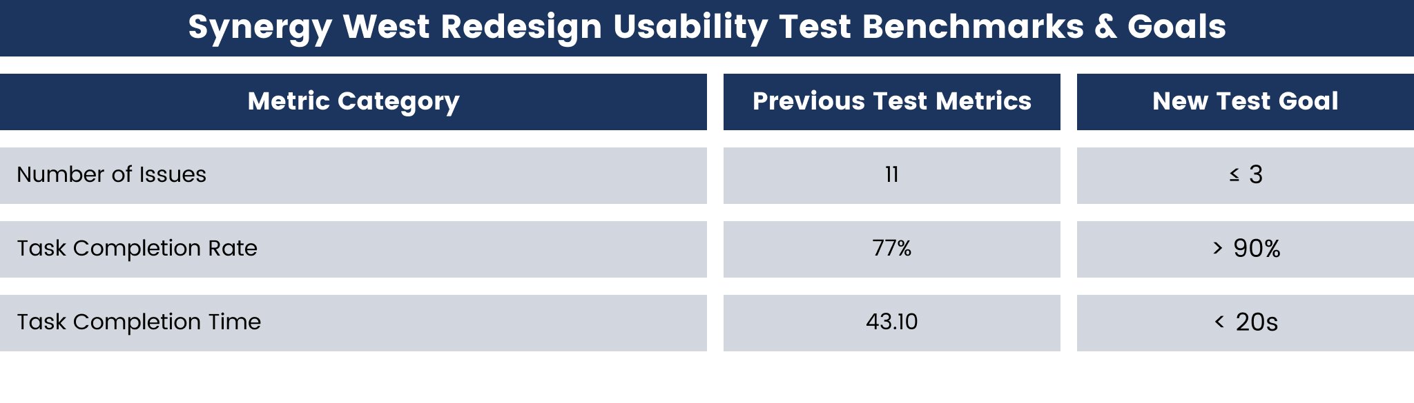
To gauge the success of our redesign, we've established clear parameters based on the metrics from our previous usability test. Using indicators such as the number of issues, participants affected, frequency rate, severity rate, task completion rate, and average task completion time, we've set a three ambitious benchmarks for improvement.
1. Reducing Issues Significantly
The previous website presented 11 usability issue categories. However, we aim to substantially minimize these issues with our redesigned solution, by bringing the number of issue categories down to three or fewer.
2. Improving Task Completion Rates
With a baseline task completion rate of 77% from our previous usability test, our goal is to elevate this metric beyond 90%. This metric was chosen due to the near impossibility of achieving 100% from participants with varying mental models around what is “usable.” However, our objective is not merely an incremental improvement but a substantial enhancement in the site's usability.
3. Drastically Reducing Task Completion Times
The average task completion time in the previous test stood at 43.10 seconds. We set an ambitious target to slash this time in half—aiming for a completion time of less than 20 seconds. This bold goal underscores our commitment to achieving a significant improvement in the overall usability and efficiency of the site.
Ensuring Data Consistency
In order to maintain a consistent evaluation framework, we engaged the identical group of five users from our prior usability test. We also chose to have them navigate through the redesigned site using the same scenarios and tasks provided to them on the existing site’s usability test.
Employing the same user pool and using the same scenarios and tasks for both evaluations represents the optimal test validation environment, as it avoids introducing new perspectives or expectations. This approach allows for a direct and unbiased comparison, ensuring precision in our analysis and a one-to-one comparison of the dataset.

Ensuring Methodological Rigor
Our choice to maintain consistency in user participation across both tests reflects our commitment to methodological rigor. By adhering to a standardized approach, we aimed to ensure the reliability of our findings and provide a comprehensive understanding of the usability improvements introduced by our prototype.
It is reasonable to anticipate a natural decrease in task completion times due to the participant’s familiarity with the content and navigation patterns from our initial usability tests. However, our redesigned site introduces substantial changes to the site’s content navigation structure. To ensure maximum data validity and to counterbalance any potential bias, we have decided to apply a five-second penalty to the average task completion time for each participant across all tasks.
Insights and Achievements
During the testing phase, a few noteworthy observations emerged—affirming the essence of conducting usability tests. Specifically, the same issue surfaced regarding the challenges users faced in locating information related to the industries served by Synergy West. However, a comparison with our competitors, demonstrated that none of them explicitly outlined the industries or sectors they catered to — likely due to the fact that waste removal is a necessity aimed to serve everyone.
Additionally, users provided valuable suggestions, expressing a desire for more blog content on the “news” page and recommending greater emphasis on the environmental impact sections by adding graphic icons.
Despite these considerations, the positive outcome was achieving our predefined goal of identifying exactly three issue categories, which was on-par with our goal target; however, only one was a true issue, while the remaining two were mere, but important suggestions. We surpassed expectations in our other metrics by achieving an average task success rate of 97%—well beyond our 90% goal. We also achieved an average total task time of 12.10 seconds. Even with the inclusion of our 5-second penalty, the total task time remained an impressive 17.10 seconds—surpassing our goal target by three seconds.
In light of these outcomes, we assert that our redesign constitutes a comprehensive success in terms of usability. The meticulous testing, insightful feedback, and surpassing of predefined benchmarks validate the efficacy of our design interventions. This underscores our commitment to delivering not just a functional but an exceptional user experience to the Synergy West website.

Brand Trust Reinstated
After each usability test, we surveyed participants about their perceptions of the design aesthetics and the likelihood of choosing Synergy West for their recycling and waste disposal needs. The ensuing results represent the averaged and rounded responses to each question asked:
On a scale of 1 to 5, where 1 denotes extreme difficulty and 5 signifies extreme ease, how easy was it for you to find the information you needed on the website? Before: 3 After: 5
On a scale of 1 to 5, where 1 indicates extreme unlikelihood and 5 indicates extreme likelihood, how likely are you to use Synergy West for your recycling and waste disposal needs? Before: 2 After: 5
On a scale of 1 to 5, where 1 signifies poor and 5 denotes excellent, how would you rate the overall design and aesthetics of the website? Before: 2 After: 5
Evidently, based on these figures, we have enhanced the overall satisfaction levels with the website and fostered increased trust in the Synergy West brand—at least among the participants included in our study.

An Important Disclaimer
It is crucial to highlight that, given the constraints in testing Synergy West's actual customers and the limited budget for recruiting users in a specific and skilled industry, the participants selected for usability tests might not possess the direct industry experience needed to substantiate their preferences fully. Their feedback primarily served to generally evaluate the usability and appeal of the Synergy West website, both before and after the redesign. Rennacker Studio acknowledges its inability to verify or guarantee results based on these studies but expresses a commitment to replication. We are confident in replicating the study results within a 10-15% margin of the outcomes presented in this case study.