

New Age Packaging Redesign
In the summer of 2021, Rennacker Studio was brought-on by New Age Naturals to redesign and expand the New Age product packaging for their line of vitamins, and supplements. As New Age expanded their product line, it became apparent that each new product felt even more disjointed from the last. Additionally, every product was being packed in a slightly different bottle color/size, leading to confusion on the production line regarding which products belonged in which bottle type.

Before and After of New Age Naturals 2020 packaging redesign by Rennacker Studio featuring the brand’s top 3 selling products
We often say that a brand isn't just a logo; it's the consistency and unity brought about by each product or service alongside the experience provided to each customer. The lack of uniformity across the New Age product lineup created a few major barriers for the business:
They were significantly over-spending by not taking advantage of bulk-ordering on bottles. This also led to long reset periods on the production line to adjust the machinery for every bottle type’s filling requirements.
Previously, it was taking 6-8 weeks to launch a new product, simply because every product label, website landing page, and amazon product page required a unique design approach because there was no unifying design system.
The company was investing loads of money into purchasing a product for a line extension, without knowing how consumers would respond to the new product.
We aimed to create a solution that would solve each of these three key problems.
Our approach to the redesign focused on unification, simplification, and minimalism. Our ethos behind the redesign was, “how much can we do with as little as possible?”
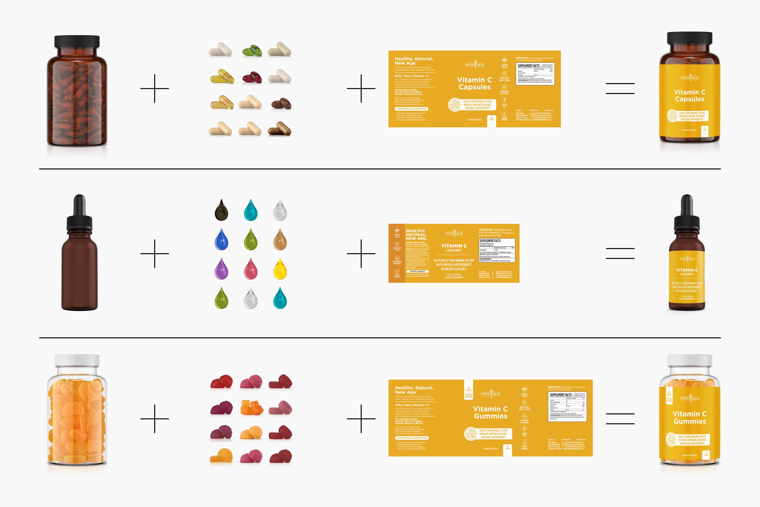
Previously, New Age essentially put every product in a slightly different bottle, prioritizing fill levels (also known as ‘ullage’) over packaging consistency. This resulted in incredible over-spending on bottles. By reducing the production line from more than 10 combinations of bottle and lid selections, down to just four, we were quickly able to save +20% on annual bottle costs.
While making sure the ullage is important so that customers don’t feel like half of their vitamins were missing, by simplifying New Age’s packaging to just two types of bottles—8 ounce amber bottles for capsules, 4 ounce amber bottles for soft gels, 2.0 ounce amber droppers for liquids, and 10 ounce clear bottles for gummies we were also able to significantly reduce production confusion and increase the margins on nearly every product while retaining the same margins on others that were already using those combinations.
Bottle manufacturing guideline for New Age Naturals 2020 packaging redesign by Rennacker Studio
By doing this, we were also able to standardize the label sizes, allowing us to use the same dies during printing for additional savings. We opted for similar sizes across the product lineup and chose to keep colors consistent across product categories—utilizing Pantone colors to maintian color fidelity and consistency. We crafted a minimalist color scheme that only utilized a single color to differentiate individual products—PMS 4063 for Apple Cider Vinegar, PMS 2012 for Vitamin D3, PMS 8485 for Zinc, and so-on—paired with alternating white text/backgrounds to introduce a clear hierarchy system with plenty of contrast.
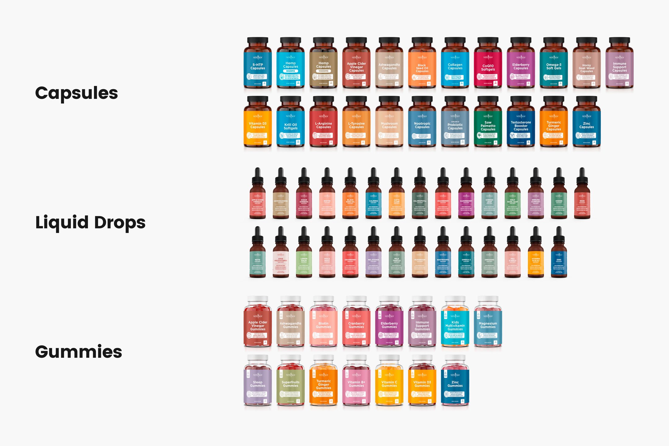
The full product lineup for New Age Naturals included 67 SKUs in total, all requiring a unified design and holistic presence with products tailored specifically for men, women, children, or in the case of some products universally appealing.
Another key decision was highlighting each product's unique benefits prominently on the packaging, turning each item into a story of its own. For example, probiotics were marketed for gut health and a balanced digestive system, while Ashwaganda was promoted for stress relief and relaxation. We worked with an incredible copywriter, Becca Thill, who did an amazing job doing meticulous research for every claim and tying all that research back to blog articles where customers could read more about the product on the New Age Website. This clear communication of benefits directly influenced customer engagement.

New Age product benefits with icon illustration on packaging labels.
Since New Age also sold their products in two-packs on Amazon, this required both bottles to be already bundled in ready-to-ship boxes—therefore, we also designed pop-up boxes that could fit two bottles side-by-side, giving a new layer to the unboxing experience.
And since there was now a sealed box, in all of the Amazon orders, we could easily sneak a little promotional card into that box. But we wanted to make it fun! So we designed a lottery-style scratcher with variable data to generate different promotional codes underneath a latex foil stamp that would offer discounts that varied from 10% off or even free bottles. But there was a catch! They had to purchase from the New Age Website—removing the middle-man, Amazon who notoriously takes 30% of every purchase from sellers. This further increased revenue by exploiting Amazon as a giant marketing platform, then slowly pushing customers to the website where margins were significantly higher.
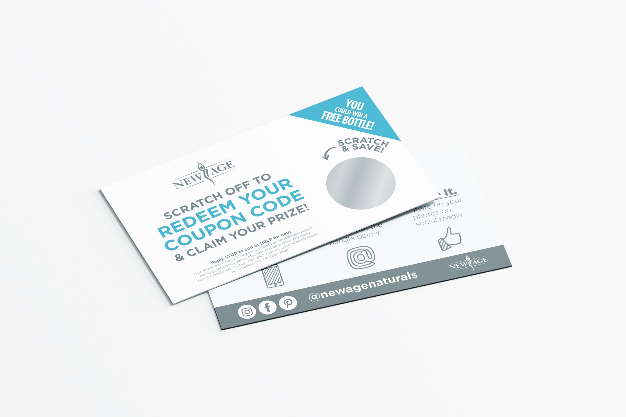
New Age lottery scratcher promotional card.
Read more about the website we designed and other projects we’ve done with New Age Naturals here:


We quickly found that the redesign changed customer purchasing behaviors. Now that buyers were able to clearly see that New Age had an entire suite of products, they began adding multiple items to their carts on Amazon and on the website. Over time, people began to trust and recognize the New Age brand.
Altogether, this project took roughly one full year to produce. It was detailed, meticulous, well-crafted, and thought out through every detail. But we’re incredibly proud of the work we produced and were incredibly rewarded with the outcome of increased savings, improved sales, and the understanding that we were able to bring a new look and feel to the entire New Age Naturals brand.