
Creating Continuity Across Your Brand
Every interaction with your brand, whether through social media, email marketing, or digital advertising, is a critical touchpoint that shapes customer perception and loyalty. Chances are there are a dozen options out there where consumers could get very similar products or services as yours—what makes you unique? If your brand lacks consistency, continuity, presence, strategy, and experience; you could quickly lose your audience to a competitor. Here, we hope to guide you on the first steps every business should take to make their brand more consistent.
What is a brand?
A brand extends far beyond a mere logo or a catchy slogan. It encompasses the entire experience a customer has with your company, product, or service. A brand is the emotional and psychological relationship a company establishes with its audience. It embodies everything from the visual elements, like design and color scheme, to the tone of voice used in communication, and even the values and promises the company stands for.

Style Guide for Arete Financial and Legal Solutions 2023 Brand Refresh designed by Rennacker Studio.
A brand is a powerful, living entity in its own right - a narrative that evolves with every interaction and touchpoint with customers. It's how a business communicates its essence, tells its story, and differentiates itself in a crowded marketplace. This narrative is crafted through a mix of tangible elements like products or services offered, and intangible elements, including the experiences and emotions associated with them.
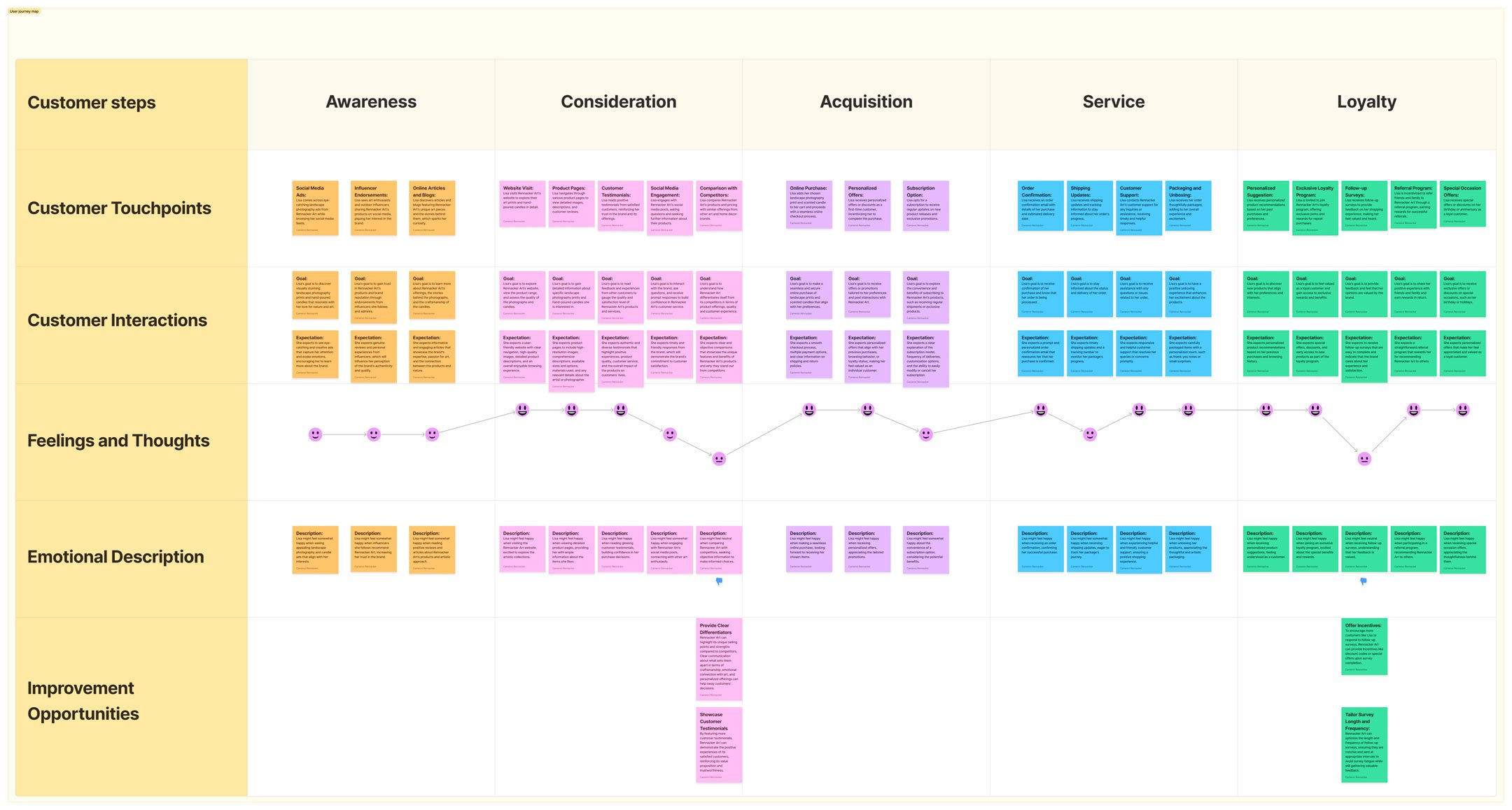
A customer journey map should identify where exactly a customer interacts with the brand within each phase of the journey—whether it's online or offline. The one depicted was created for Rennacker Art by Rennacker Studio.
In short, a brand is a set of perceptions and images that represent a company, product, or service. While many people refer to a brand as a logo, tagline, or audio jingle, a brand is actually much more. Ultimately, a brand lives in the minds of consumers and is shaped by their experiences and perceptions. A brand is not just what you say it is, it’s what consumers believe you to be.
The Make-or-Break Moment
Your brand's first interaction with a customer is often through digital platforms like social media, email marketing, or sometimes digital advertising. This initial contact is a make-or-break moment to create a lasting first impression. In general, a disjointed appearance or tone can create confusion, erode consumer trust, and lead to under-conversion in your website traffic. In contrast, a study by Marq (2021) reveals that “consistent brand presentation across these platforms can increase revenue by up to 23%.”
The psychology behind first impressions reveals that customers form opinions in a matter of seconds, 2.6 seconds to be exact, according to the Missouri University of Science and Technology (Careaga, 2012). This extremely brief window is your business's opportunity to communicate who they are, what they stand for, and why a customer should engage with the brand.

(Source: Unbreakable Kimmy Schmidt, featuring actor Tituss Burgess)
Consistency in visual elements like colors and logos, and more specifically in the tone of your messaging, helps to forge a strong, and if done well, a positive first impression. It's not just about aesthetics; it's about creating an emotional connection and communicating clearly and concisely. This resonates with the psychological concept of 'thin-slicing', where people make quick, often subconscious, judgments about your brand with the limited information they have. Crafting a consistent brand image across all platforms helps ensure these rapid assessments are always positive and well-aligned with your brand’s overall identity.

A fake (but still relevant) inconsistent branding example of the infamous spoof for Colgate kitchen entrees (Source: Smart Insights)
Small Business, Big Presence
For small to medium businesses, brand consistency is both a marketing strategy and a survival tool. Consistent branding helps smaller businesses stand out, particularly in heavily saturated markets.
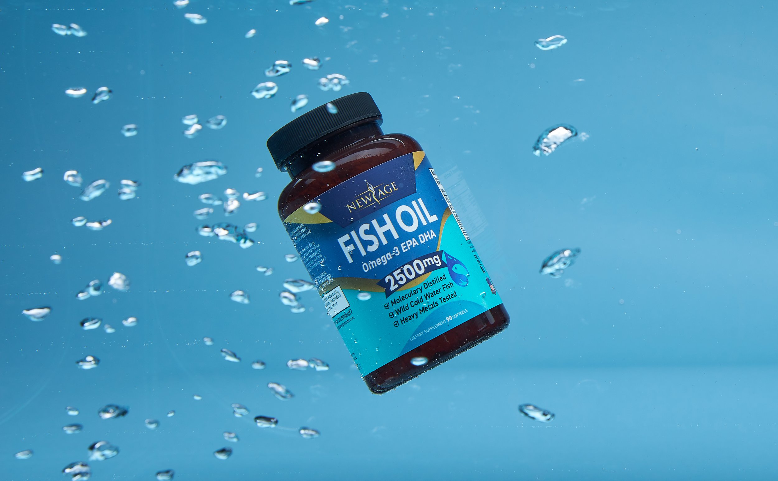
In 2020, Rennacker Studio worked with New Age Naturals, a vitamin and supplement brand struggling against a sea of competitors, including national brands, during COVID-19 while everyone was looking for a way to stay healthy against a global pandemic. New Age was selling their products 100% through Amazon and when we took them on as a client, every product had a vastly different label from the next, bottles were all different sizes and colors, and there was frankly their brand had zero digital presence.

Before and After of New Age Naturals 2020 packaging redesign by Rennacker Studio featuring the brand’s top 3 selling products in 2021: Apple Cider Vinegar Gummies, Vitamin C Gummies, and Immune Support Gummies.
Our first step toward creating a more cohesive brand for New Age was to create a less ambiguous guide for bottling their products. We found out that New Age was packing products in 17 different bottle and lid combinations. They had so many ways to pack their product that the folks working the production lines often became confused about what products went into which bottles. Not to mention, New Age was spending lots of money ordering smaller quantities of bottles when they could easily negotiate a better price on a larger quantity of one or two bottle types.

Bottle manufacturing guideline for New Age Naturals 2020 packaging redesign by Rennacker Studio.
Once we had the bottles figured out we set out to create a unified system for each of their labels. This redesign had had a two-pronged effect on the business:
It would make launching new products much easier because each product label wouldn’t require a bespoke look and feel—ultimately reducing the amount of time it would take to launch products. Simply change the color, update the claims and supplement facts, send ‘em to print, et voilà! New product ready for market!
New labels refreshed the brand and ultimately brought about a more impactful brand with a rich story we could tell on platforms like social media, Amazon, and the next thing we’ll talk about—their website!
The redesign worked so well, in fact, we were able to create an entirely new product called “liquid drops” that utilized the exact same structure in a much more condensed label format.
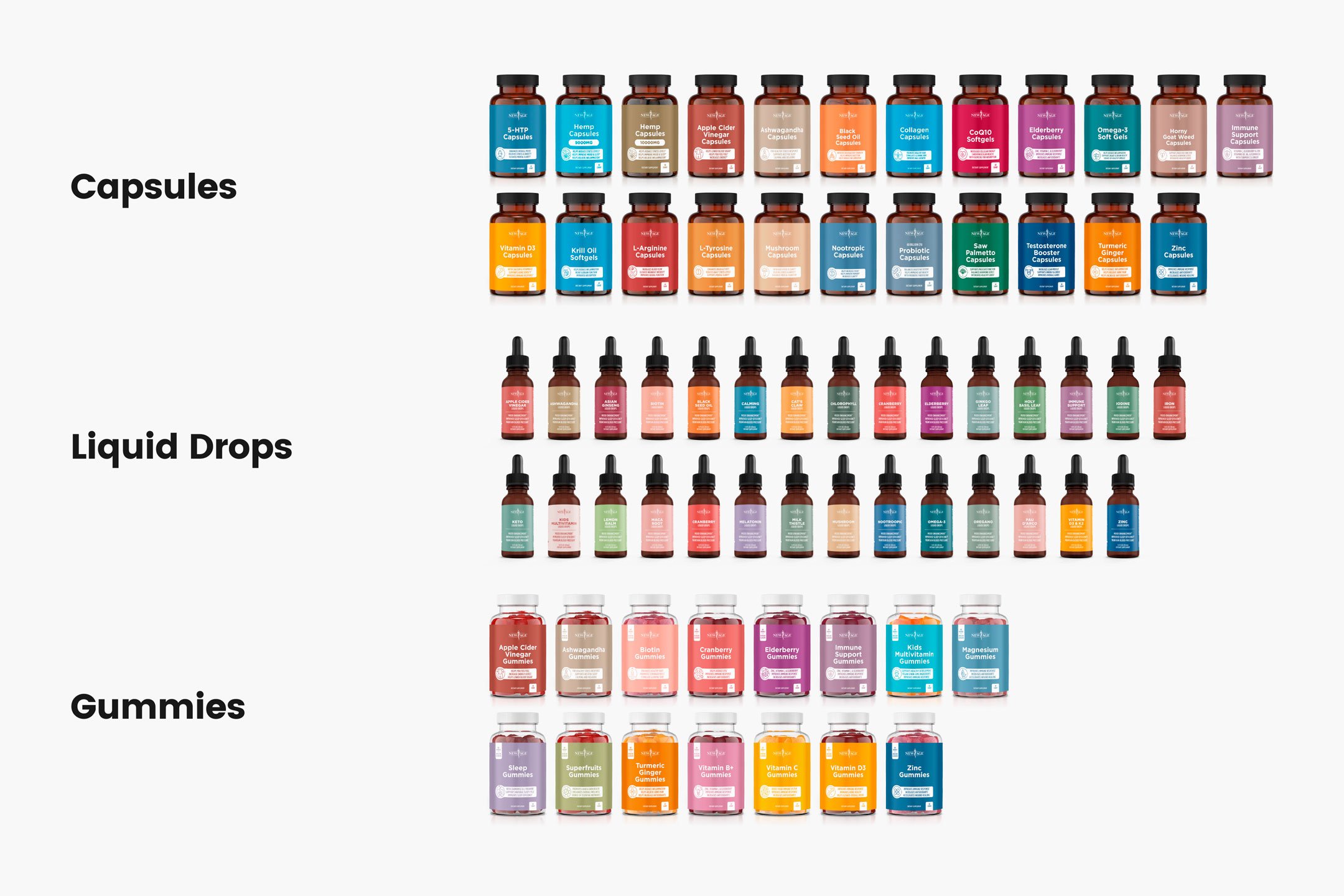
The full product lineup for New Age Naturals included 67 SKUs in total, all requiring a unified design and holistic presence with products tailored specifically for men, women, children, or in the case of some products universally appealing.
Finally, now that the brand had a more sophisticated look to it, New Age could really start to capitalize on it. We built them a website where the products could be front-and-center. Combining a young lifestyle look in the photography and a more traditional illustration style for things like icons and color palettes.

Redesigned website for New Age Naturals that allowed for the products to be the hero without the need for an overly complex design system or sales strategy that could be easily maintained by New Age’s staff.
All of these efforts combined resulted in New Age both saving hundreds of thousands of dollars per year on purchase order expenses while also increasing annual revenue substantially through the use of additional revenue streams like a new website and social media marketing that reflects the brand’s values and tone.


Color Continuity
At Rennacker Studio, we like to say that color is a silent ambassador for your brand. Every color has a different psychological impact on your customer (Color Psychology). Blues are more calming and instilling of trust (Al-Ayash, Et al., 2015), reds more primitive and evocative of power (Cherry, 2023. Choosing a color that resonates with your customers is potentially one of the most impactful design elements that can be used to create brand continuity.

There’s much more to choosing a brand color than just picking one. It involves psychology that reinforces your brand’s mood and tone. Any shift in that color could throw it off, making color consistency vital in any brand’s color application. (Source: Praxent)
One of the most prominent examples of using color to create brand consistency is the iconic Tiffany Blue. Tiffany has gone so far as to register the Tiffany Blue color with the USPTO as a trademark, alongside an additional trademark for their Tiffany Blue Box. They leverage these trademarks subtly on their website featuring the soft blue as an underline for clickable links and feature the blue boxes prominently in their photography—sometimes accompanied by a blue background. Then on social media, they get a bit louder with their use of the blue in their photography.

American luxury jewelry retailer Tiffany & Co. is internationally renowned for its diamond and sterling silver jewelry but equally known for its iconic Tiffany Blue. (Source: Tiffany & Co.)
However, maintaining color consistency across print and digital mediums can be complex challenge. The same color can vary drastically between computer screens (all of which vary slightly based on assigned color profiles and age) and a printed page due to different color models: RGB (Red, Green, and Blue) for digital and CMYK (Cyan, Magenta, Yellow, and Key) for print.
Fun fact: The “key” plate was used to line up the color registration of the printing plates for the other colors because it generally had the most color and was commonly used for printing the color black (Jukebox, 2021.

Designers and printers can get a bit nerdy about color—down to the point where we will examine every dot gain under a printer’s loupe or, in more high-tech situations, a color spectrometer to look for flaws or deficiencies in the color or print coating—both of which impact the visual consistency of color. (Source: GuruXOX)
To overcome the variance from print to digital and vise-versa, brands should always adhere to strict color standards. Utilizing established systems like Pantone colors ensures that a specific hues are replicated accurately across different mediums. Pantone, for example, is known for its precision in color matching, which is why it's widely used in both digital and print design. By specifying Pantone colors in your designs, you can maintain color fidelity whether your audience is viewing your brand on a screen or holding a printed piece in their hands.

Every year in December, Pantone releases the next year’s “color of the year.” The Pantone Color Institute studies color trends throughout the year to decide on a single color that is reflective of rising trends in fashion, marketing, social media, and even politics. (Source: xalien)
Brand Saturation vs. Brand Strategy
Brand saturation occurs when a company's marketing efforts are so pervasive that they start to overwhelm or even annoy the audience to the point where your message simply becomes chaff. This overexposure can lead to brand fatigue, where the constant presence of a brand begins to lose its impact or, worse, elicits negative reactions. On the other hand, a strategic brand presence is about being visible in a way that is consistent, relevant, and engaging to your target audience. It's not about being everywhere; it's about being where it matters most, and in a way that resonates with your audience.

McDonald’s partnered with Cossette to create a “Follow the Arches” campaign. Utilizing multiple billboards and piecing out the iconic arch logo to funnel drivers off the road and into a McDonald’s store. While it’s certainly a creative approach, it’s a bit like shouting when you’re already the loudest person in the room. (Source: Cossette)
The Tropicana case from 2009 is a classic example of how straying too far from your brand identity can have dire consequences. Tropicana's decision to completely overhaul its packaging design led to a significant disconnect with its customer base. The new design was a radical departure from its well-established brand image and made it harder for customers to recognize and relate to the product.
Tropicana’s orange juice became generic, and customers stopped relating to it. As a result, Tropicana experienced a 20% drop in sales within just two months, totaling $30 million in losses on a packaging redesign of the iconic orange juice brand, then invested $35 million into a major advertising campaign that flopped (Business Insider, 2013). According to Business Insider, “in total, this innitiative cost Tropicana more than 50 million dollars. This starkly illustrates the importance of maintaining brand consistency and understanding customer expectations. Following this backlash, Tropicana wisely reverted to its original packaging design—all within 47 days.
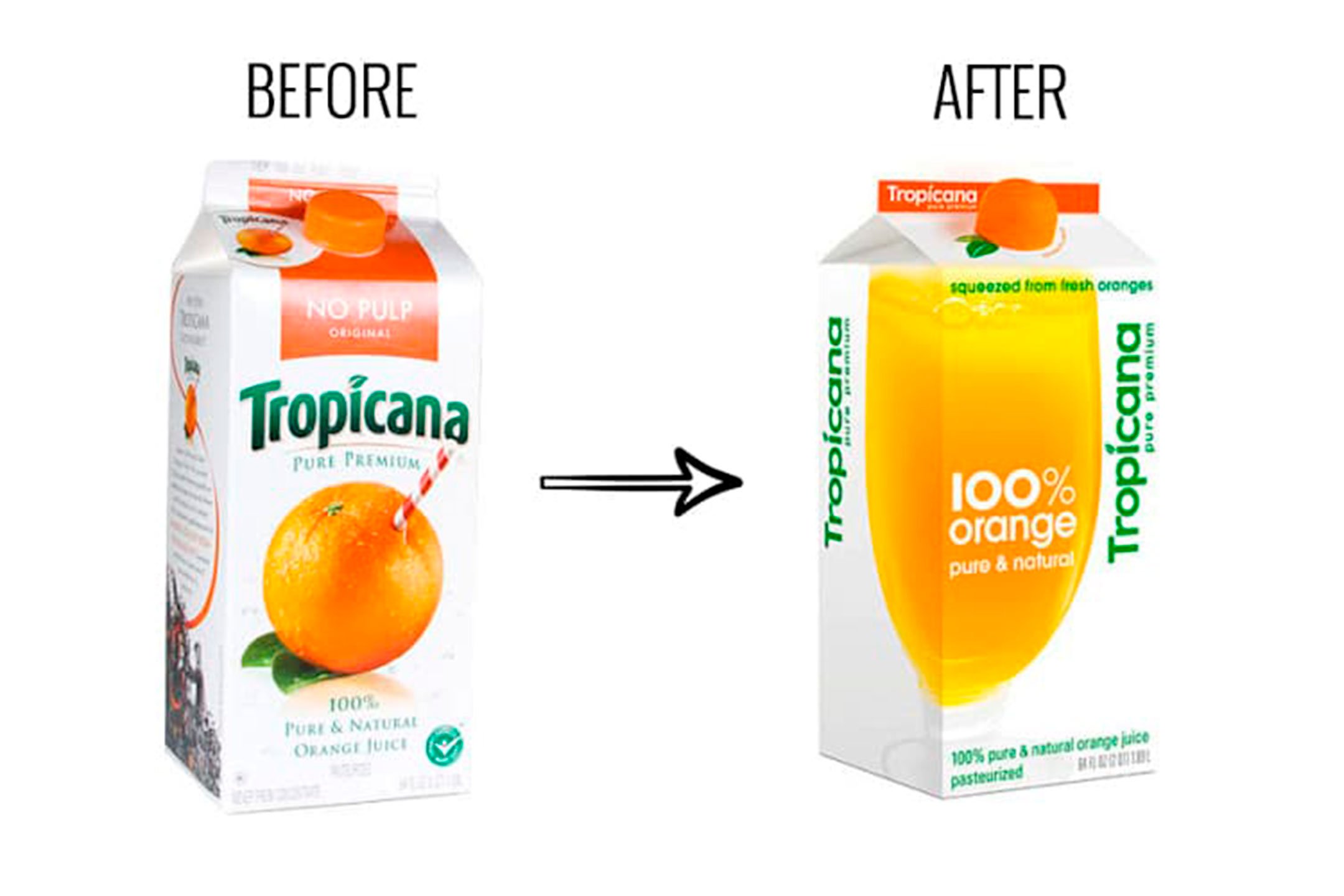
The 2009 packaging redesign failure of Tropicana (owned by PepsiCo), partnered with Arnell to redesign their best-selling orange juice which landed in a complete flop with a 20% reduction in sales and a total $50 million in losses over 47 days. (Source: The Branding Journal)
While brand saturation and brand strategy might seem similar in their goal of maximizing visibility, no amount of saturation can prevent the headaches caused by a poorly executed strategy or lack thereof. Even well-known brands are susceptible to downfall in the face of introducing change for the sake of change.
Responsive Logos
Today, brand interactions occur across a multitude of devices and platforms, the importance of a responsive logo in maintaining brand consistency cannot be overstated. A responsive logo is a dynamic, adaptable version of a brand's primary identifying mark, designed to maintain its essence and recognizability across various applications and screen sizes. This ensures that the brand is consistently represented, whether it's being viewed on a large desktop monitor, a mobile phone, or even as a repeating pattern on gift wrap.
Designer Joe Harrison created an experimental project called Responsive Logos to explore creating scalable logos for some of the world's biggest brands. (Source: Joe Harrison)
A responsive logo thoughtfully scales back elements of the design to suit smaller spaces while retaining the key elements that make that logo identifiable in the first place. For instance, a complex logo might be simplified to its basic shapes or initials when displayed on a smaller screen. This ensures that the logo remains legible and impactful, even when space is limited. It's a delicate balancing act between maintaining the logo's integrity and ensuring its functionality across different platforms.

Joe Harrison’s exploration of responsive design for Irish stout brand, Guinness. (Source: Joe Harrison)
A responsive logo demonstrates an understanding of modern consumer habits and the diverse ways in which people interact with brands today. A responsive logo is a statement, signaling a business’ commitment to providing a seamless and coherent brand experience to their consumers, regardless of how or where the brand interaction is happening. This level of attention to detail in brand presentation can significantly enhance brand recognition and loyalty (Mihajlovic Et al., 2016)
4 Steps to Achieve Brand Consistency
Step 1: Define
Make an organizational initiative, work with a design team or hire a creative agency to define a comprehensive brand guideline document or better yet, a toolkit that can be used independently by you and your staff. This should include your logo usage, color palette, typography, imagery, and tone of voice. Ensure everyone in your team understands and (most importantly) adheres to these guidelines. Refer back to those guidelines for everything your brand touches.
Does your org have brand guidelines that are widely adopted and easy to find?
(Source: Marq, 2021 Brand Consistency Report)
Step 2: Audit
Take stock of all your current brand materials. Audit for consistency in your website, social media, print materials, etc. Identify areas that need alignment with your newly-established brand guidelines. To be clear, that doesn’t mean to go nuke your instagram account! It just means establish a moment in time where the new standards ought to be implemented. Regular brand audits help you identify bottlenecks and points of failure in your branding strategy and the root cause of these issues.
Frequently Created Templates
(Source: Marq, 2021 Brand Consistency Report)
Step 3: Create
Develop a content strategy that reflects your brand voice and visual style and start try to create as much content as possible. You can even create a series of frameworks or templates that allow for variance and autonomy while retaining the brand’s overall consistency. According to a Brand Consistency Report produced by Marq in 2021, 82% of organizations use templates? Don’t scoff at the power of a good template! Whether it's blog posts, social media updates, or marketing materials, as long as that template is consistent in tone and look to your brand, you’re good! You can also hire design agencies like Rennacker Studio to produce easy-to-use templates in softwares you’re familiar with for you to effortlessly maintain on your own if you’d like.
How long does it take your in-house design/marketing team to fulfill a request for new or customized content?
(Source: Marq, 2021 Brand Consistency Report)
Step 4: Review
Your brand is always evolving, its not a set-and-forget task. Regularly review your brand's performance across different channels. Use analytics wherever possible and listen to your customers to determine if changes are being well-received and be open to making adjustments while staying true to your core brand identity.
How often is off-brand content created at your company?
(Source: Marq, 2021 Brand Consistency Report)
The Bottom Line
Brand consistency has a direct and significant impact on a company's bottom line and the perception others have about your brand. A consistent brand resonates more effectively with its audience, fostering trust, recognition, and loyalty (Forbes, 2019). “A business with consistent branding tends to experience up ****to 20% greater overall growth and 33% higher revenue compared to one that struggles with off-brand content.” (Marq. 2021) Ultimately, investing in brand consistency is not just about maintaining a certain look or style; it's about building a strong, recognizable, and reliable presence in the market, which in turn, contributes to a company's lasting success and reputation.
If your brand or business needs help improving it’s consistency, Rennacker Studio would love to help you! Schedule a FREE Brand Audit today or Contact Us to discuss how we can help.